
Ember Steakhouse
Charcoal with ember orange, dark and appetite first.
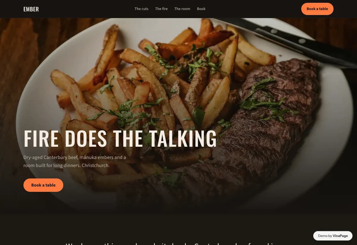
Steakhouse customers arrive knowing the vocabulary. They want cut, weight, grade and how it is cooked. A page that talks about ambience and passion instead of specifics is talking past the person most likely to book.
This is one of the few restaurant categories where the buyer is genuinely informed, so precision is more persuasive than atmosphere. The design gets out of the way of the numbers rather than dressing them up.
Design decisions
- 01
Cuts are listed with weight and grade
Not descriptions of tenderness. A customer who knows the difference between two hundred and three hundred grams is the customer who books a steakhouse on a Friday.
- 02
Photography stays dark and close
Char, crust, rest. Brightly lit food photography flattens exactly the surface the kitchen spends its effort on.
- 03
Booking asks time, not table preference
Preference fields create expectations the floor cannot always meet, and a broken expectation on arrival costs more than the field was ever worth.
What is built into it
- Cut list with weights
- Dark food photography
- Booking form
- Wine list
Ember Steakhouse is a design study. The business, its address and its reviews are invented so we can show a finished website instead of a flat mockup. Nothing on this page describes a real client of VinaPage.