
Fern & Fork
Airy sage and cream with hand-drawn touches and morning light.
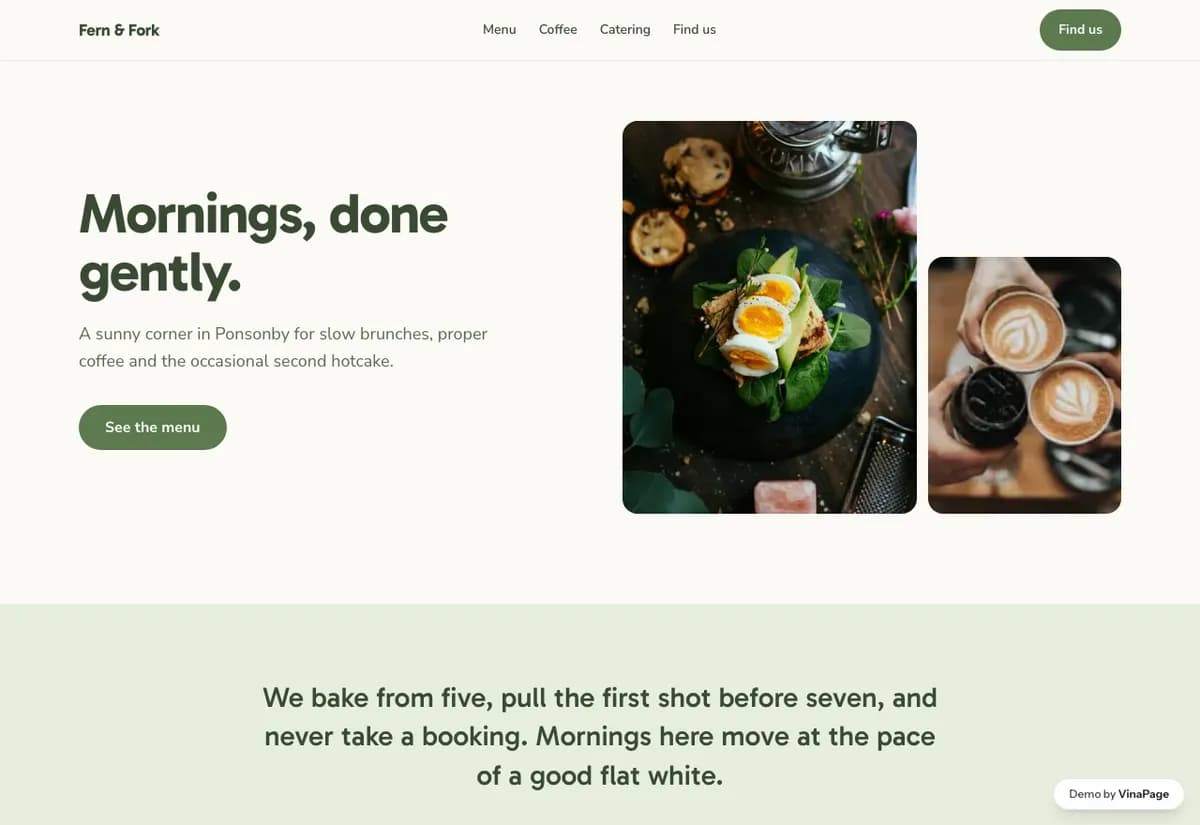
Brunch is decided on a Saturday morning, on a phone, about twenty minutes before people leave the house. Nothing about that moment rewards a long scrolling story, and most cafe websites are built as though it did.
The whole design brief is answering three questions fast: are you open, is there a wait, what is on. Everything else on the page is subordinate to those, including the parts that would look better in a portfolio.
Design decisions
- 01
Hours and wait sit above everything
Not in a footer, not on a contact page. It is the reason the site was opened, and burying it sends the group to whichever cafe answered first.
- 02
The menu is shot in daylight, not styled
Brunch food photographed under warm restaurant lighting looks like dinner. Matching the light to the actual hour is what makes it read as the meal being sold.
- 03
Booking is offered, never pushed
This is a walk-in room. Leading with a reservation flow would make a group of four assume they cannot just turn up, which loses the table entirely.
What is built into it
- Hours and wait block
- Daylight photo menu
- Optional booking
- Hand-drawn detail
Fern & Fork is a design study. The business, its address and its reviews are invented so we can show a finished website instead of a flat mockup. Nothing on this page describes a real client of VinaPage.