
Harbour & Vine
Off-black editorial with wine tones and the kitchen leading the story.
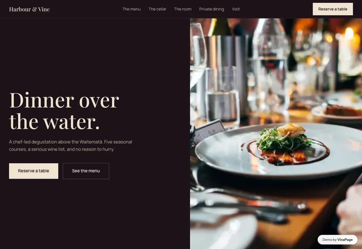
Fine dining is booked weeks ahead for an occasion, usually by someone who has never eaten there. The site has to justify a large bill to a person with no first hand evidence, which is a much harder job than listing dishes.
At this level the chef is the product. Restaurants in this bracket keep hiding that behind interior photography, which is interchangeable, while the one genuinely unrepeatable thing about the business gets a paragraph on a second page.
Design decisions
- 01
The kitchen story comes before the menu
Someone choosing a restaurant for an anniversary is choosing a person to cook for them. The menu answers what, the story answers why here and not the place next door.
- 02
The mailing list is treated as a real conversion
A room with forty seats cannot grow by filling more tables tonight. It grows by owning a list it can fill a quiet Tuesday with, so the signup is designed rather than dropped in the footer.
- 03
The reservation form asks what the occasion is
One extra field that lets the restaurant do something on the night. It costs the guest three seconds and it is the difference between a booking and a returning customer.
What is built into it
- Kitchen story section
- Mailing list signup
- Reservation form
- Photo menu
Harbour & Vine is a design study. The business, its address and its reviews are invented so we can show a finished website instead of a flat mockup. Nothing on this page describes a real client of VinaPage.