
Kōura
Sand and deep sea blue, kept as light as the food.
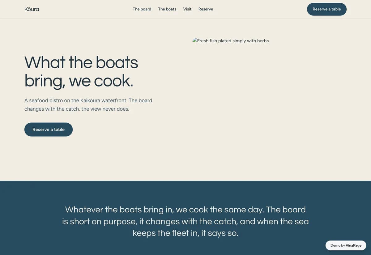
Every seafood restaurant claims the catch is fresh. Because all of them say it, none of them are believed, and the claim ends up being decoration rather than a reason to book a table.
Freshness has to be demonstrated structurally rather than asserted in copy. A menu that visibly changes is evidence. A sentence saying the fish is fresh is not, no matter how well it is typeset.
Design decisions
- 01
The menu is built to look like it changes
Catch led sections rather than a fixed list. The structure itself says the kitchen buys what came in this morning, which is the claim the copy was failing to make.
- 02
A light palette against the category default
Seafood restaurants reach for navy and rope. Sand and open water reads as the coast rather than as a nautical theme restaurant.
- 03
The reservation form asks for almost nothing
Date, time, size, name. Every extra field on a booking form is a place to abandon it, and none of them help the restaurant seat the table.
What is built into it
- Catch-led photo menu
- Coastal palette
- Reservation form
- Wine pairing notes
Kōura is a design study. The business, its address and its reviews are invented so we can show a finished website instead of a flat mockup. Nothing on this page describes a real client of VinaPage.