
Nonna's Table
Warm checkered comfort with the family story built in and the menu as the star.
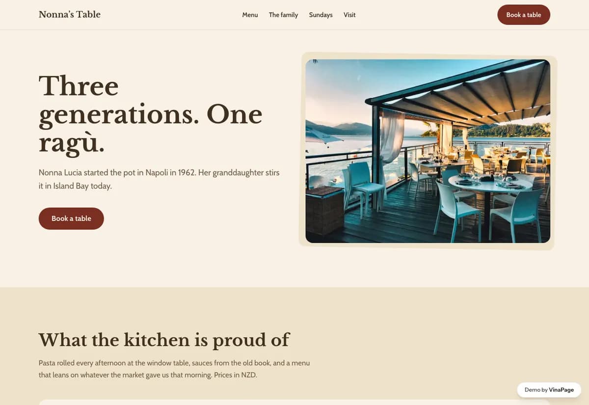
Family restaurants trade on longevity, but longevity is almost always reduced to a date in a footer. Since 1987 tells a diner nothing, and the actual asset, three generations cooking the same food, goes completely unused.
The temptation with an older family restaurant is to modernise the look so it does not seem dated. That erases the only thing a new competitor cannot buy. The design keeps the warmth and spends its effort on making the menu legible instead.
Design decisions
- 01
The family story is structural, not a paragraph
It runs through the page rather than sitting on an About tab nobody opens. This is the moat, so it gets the space a moat deserves.
- 02
The menu takes the most room on the page
For a trattoria the menu is the product and the marketing at the same time. Everything else is arranged around it.
- 03
No modernisation for its own sake
The checkered warmth stays. Stripping it back to minimal white would make the restaurant look like it is embarrassed about being what it is.
What is built into it
- Family story running through the page
- Large photo menu
- Reservation form
- Checkered palette
Nonna's Table is a design study. The business, its address and its reviews are invented so we can show a finished website instead of a flat mockup. Nothing on this page describes a real client of VinaPage.