
Perilla and Pine
Cool chalk and gochujang red, a charcoal grill at the centre, and photography doing the explaining that copy cannot.
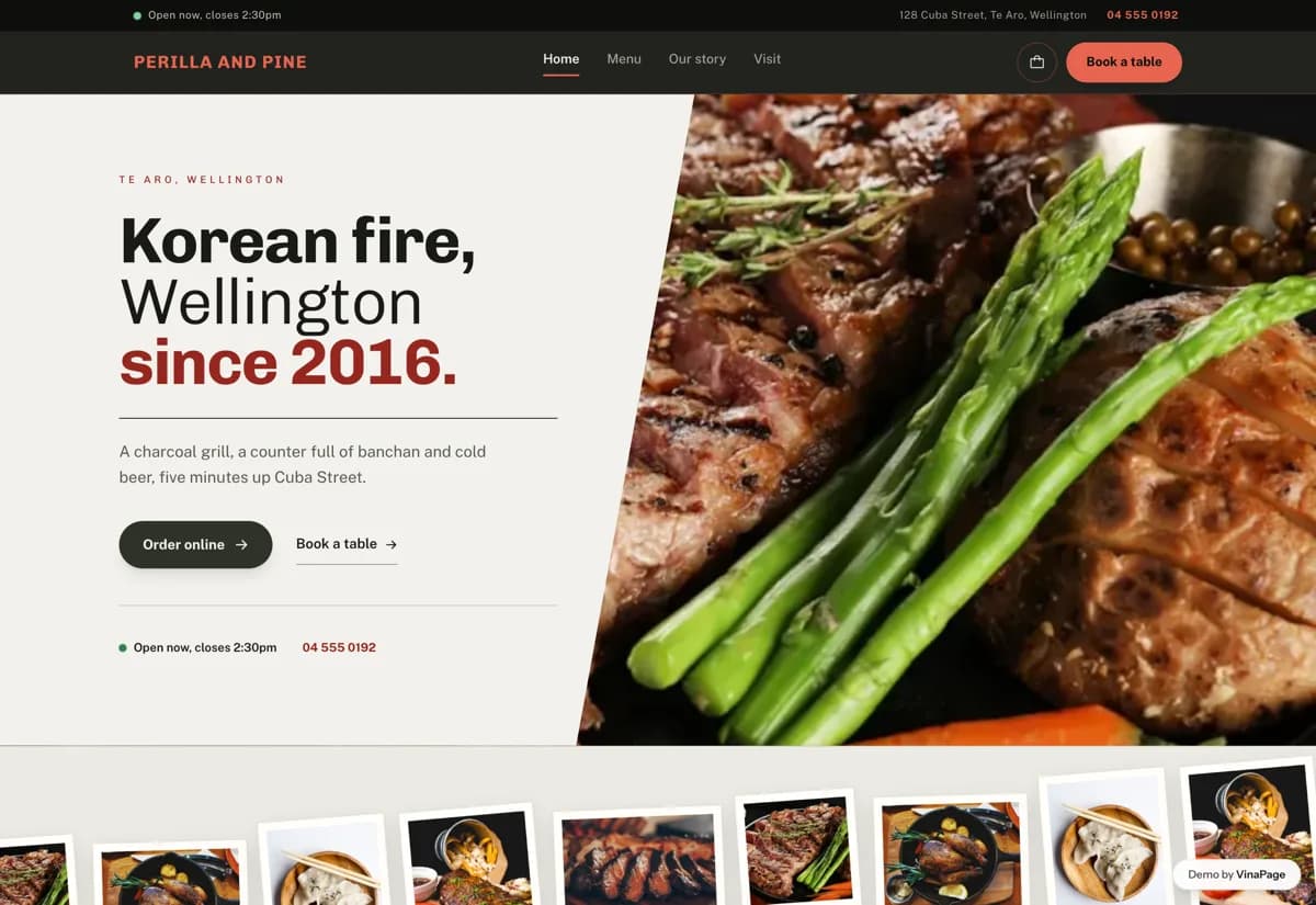
Korean restaurants in New Zealand carry a menu most diners cannot read their way into. The dish names are romanised Korean, the descriptions are a list of ingredients, and someone who has never ordered galbi has no way to tell it apart from bulgogi. They order the one thing they recognise, or they go somewhere else.
A grill house sells heat and smoke, neither of which survives a stock photo of a plated dish on white. The site leans on one long tilted contact sheet of every plate that has a photo, so the menu is legible as pictures before anyone reads a word of it.
Design decisions
- 01
The Korean name leads, the English explains
Every item shows the romanised name large and in the accent colour, with a plain English line underneath. Someone who knows the cuisine finds their dish instantly. Someone who does not gets a sentence that tells them what arrives, without the menu talking down to either.
- 02
Search that ignores accents
The search folds diacritics on both sides before comparing, so a phone keyboard with no long vowels still finds everything. This is not a nicety. Searching the obvious spelling and getting nothing is the fastest way to make someone close the tab.
- 03
The order basket survives the page change
The basket lives above the four routes rather than inside the menu page. Someone can add a dish, read the story, check the hours and still have their order. A basket that empties on navigation teaches people not to trust it.
- 04
Dietary tags are declared, never inferred
Each item carries its tags by hand. An earlier build guessed them from the description and matched vegetables inside vegetarian, which put a vegetarian label on a beef dish. For an allergen or a diet, a wrong label is worse than no label.
What is built into it
- Next.js
- Tailwind
- Motion
- Google Maps embed
Perilla and Pine is a design study. The business, its address and its reviews are invented so we can show a finished website instead of a flat mockup. Nothing on this page describes a real client of VinaPage.