
Tulsi House
Saturated spice colours with pattern used to build the layout.
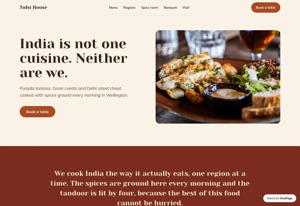
Contemporary Indian dining is held back by a visual stereotype it did not choose. Diners expect a certain look before they arrive, and a kitchen doing modern work has to break that expectation on the website or spend the whole meal fighting it.
Pattern is usually applied to these sites as a border or a background wash, which reads as decoration. Using it structurally, to divide and organise the page, keeps the cultural signal while making the design feel current rather than themed.
Design decisions
- 01
Pattern organises the page instead of decorating it
It marks section boundaries and carries hierarchy. Reduced to a border it becomes wallpaper, which is exactly the stereotype the restaurant is trying to leave behind.
- 02
Heat is stated on every dish
It is the single most common question asked at the table. Answering it in the menu removes a conversation that slows service and makes cautious diners order the safest thing.
- 03
The food is photographed, the room is not
Modern Indian plating is the argument. Interior shots would put the diner back inside the assumption the design is working to break.
What is built into it
- Structural pattern system
- Heat level on each dish
- Photo menu
- Reservation form
Tulsi House is a design study. The business, its address and its reviews are invented so we can show a finished website instead of a flat mockup. Nothing on this page describes a real client of VinaPage.