
Hazel & Willow
Warm olive and brick with a personal, hand-made feel.
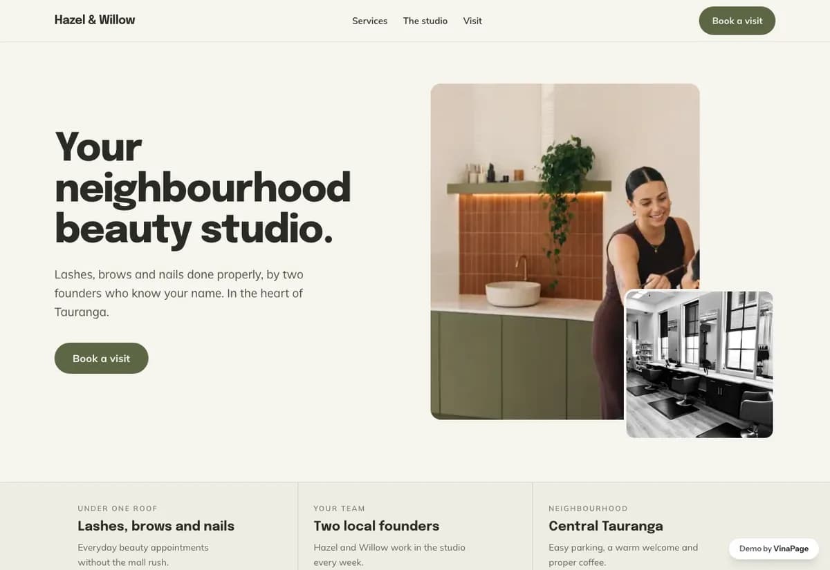
A studio doing lashes, brows and nails is really three businesses sharing a room. One combined price list confuses everyone, because a lash client and a nail client are not looking for the same thing at all.
Small studios win on the person, not the premises. The visual language stays close to something made by hand rather than something ordered from a template, because that is the actual difference the client is buying.
Design decisions
- 01
A switcher separates the three services
One control moves between lashes, brows and nails so each reads as its own menu. Merging them into a single long list makes every customer scroll past two thirds of the page that is not for them.
- 02
The gallery is a polaroid wall, not a portfolio grid
It matches the scale of the business. A glossy grid would promise a chain, and the studio is not one.
- 03
The studio page carries the personal voice
For a one or two person operation, the About page is a sales page. It is written to sound like a person rather than a company.
What is built into it
- Service switcher
- Polaroid gallery wall
- Studio page
- Booking form
Hazel & Willow is a design study. The business, its address and its reviews are invented so we can show a finished website instead of a flat mockup. Nothing on this page describes a real client of VinaPage.