
Lumen Nails
Porcelain minimalism. The nail gallery is the whole story.
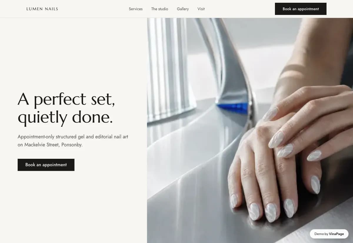
At atelier prices the portfolio has to carry the sale on its own. Most salon sites bury the photographs under paragraphs about passion and attention to detail, which is the copy every competitor also wrote.
Whitespace is how a website says expensive without writing the word. When work is charged at the top of the market, crowding the page with text reads as justification, and justification reads as doubt.
Design decisions
- 01
The lookbook is a destination, not a footer gallery
It sits in the main navigation because it is the reason someone is on the site. Burying the portfolio under About is the most common mistake a salon site makes.
- 02
Images arrive one at a time
A carousel with real reveals rather than a wall of thumbnails. A grid invites scanning, which is the wrong behaviour for work that rewards looking closely.
- 03
The price menu is plainly typeset
No badges, no strike-throughs, no limited-time framing. At this price point, discount language damages the brand more than it moves a booking.
What is built into it
- Lookbook carousel
- Editorial media blocks
- Price menu
- Booking form
Lumen Nails is a design study. The business, its address and its reviews are invented so we can show a finished website instead of a flat mockup. Nothing on this page describes a real client of VinaPage.