
Manuka Bloom Spa
Deep bush greens and honey light, with scenes that move as you scroll.
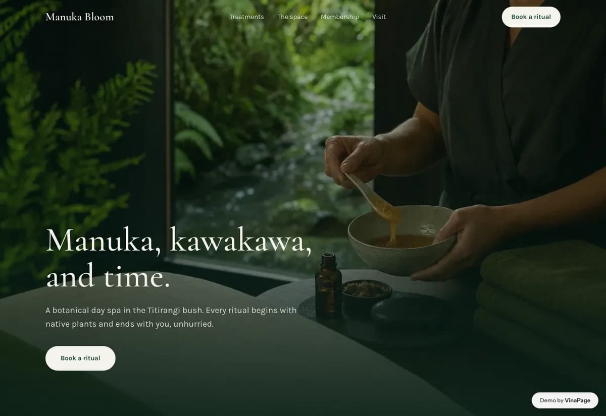
Botanical spas talk about nature in words while showing stock photography of white towels. The promise and the picture do not match, so nothing about the page feels like the place it describes.
This kind of spa sells an environment more than a procedure. Motion that reveals depth as you move down the page does what a paragraph about tranquility cannot, and it does it before anyone reads a word.
Design decisions
- 01
The space gets its own page
Not a strip of photos at the bottom of the home page. People choosing a botanical spa are choosing a room to spend two hours in, so the room deserves the same weight as the treatment list.
- 02
Treatments read as a menu, not a catalogue
Grouped by what the visit is for rather than by product line, because nobody arrives knowing they want a specific branded facial.
- 03
Membership sits after the treatments, never before
Asking for a recurring commitment before someone has seen a single treatment is the fastest way to lose them. The page earns the ask first.
What is built into it
- Parallax scenes
- Treatment menu
- Membership page
- Booking form
Manuka Bloom Spa is a design study. The business, its address and its reviews are invented so we can show a finished website instead of a flat mockup. Nothing on this page describes a real client of VinaPage.