
Petal & Chrome
Pastel pop with chrome accents and a sticker-board gallery.
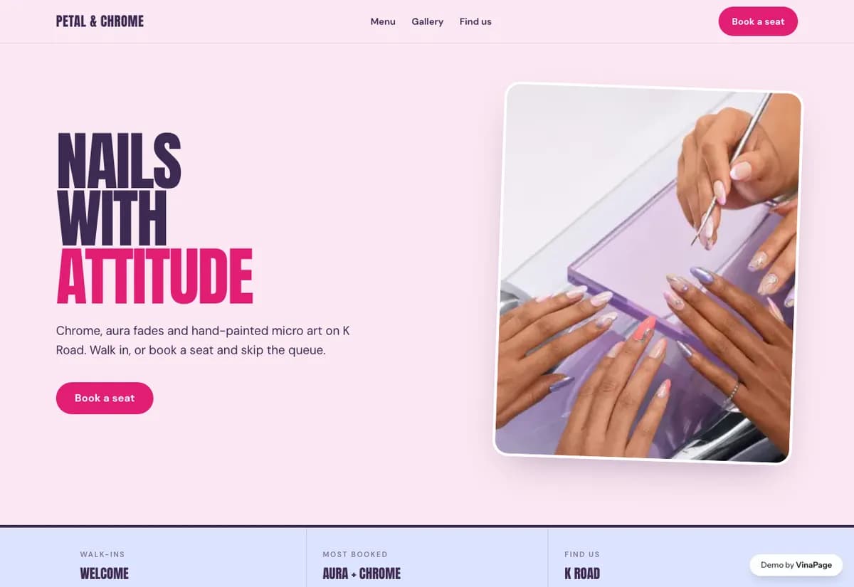
Nail art is bought on personality. A studio doing chrome, stickers and hand-painted work cannot sell it from the same soft neutral template every salon uses, because that template flattens exactly what the client is paying extra for.
The work is loud, so the site is loud. A restrained page would read as a studio that is embarrassed about its own product, and the customer who wants chrome nails would assume they are in the wrong place.
Design decisions
- 01
The gallery behaves like a sticker board
Overlapping, tilted, deliberately imperfect rather than a tidy grid. It matches how the work actually gets shared between friends.
- 02
Passes are sold as a page, not a line item
Repeat nail art customers come back on a cycle. Giving passes real space turns a one-off booking into a habit.
- 03
Kinetic type in the header, still everywhere else
One moment of movement at the top does the personality work. Animating every section would make the gallery harder to read, which defeats the point.
What is built into it
- Sticker board gallery
- Kinetic header
- Chrome type treatment
- Passes page
Petal & Chrome is a design study. The business, its address and its reviews are invented so we can show a finished website instead of a flat mockup. Nothing on this page describes a real client of VinaPage.