
Polish Bar
Monochrome with a single hot pink pop, built for a walk-in decision.
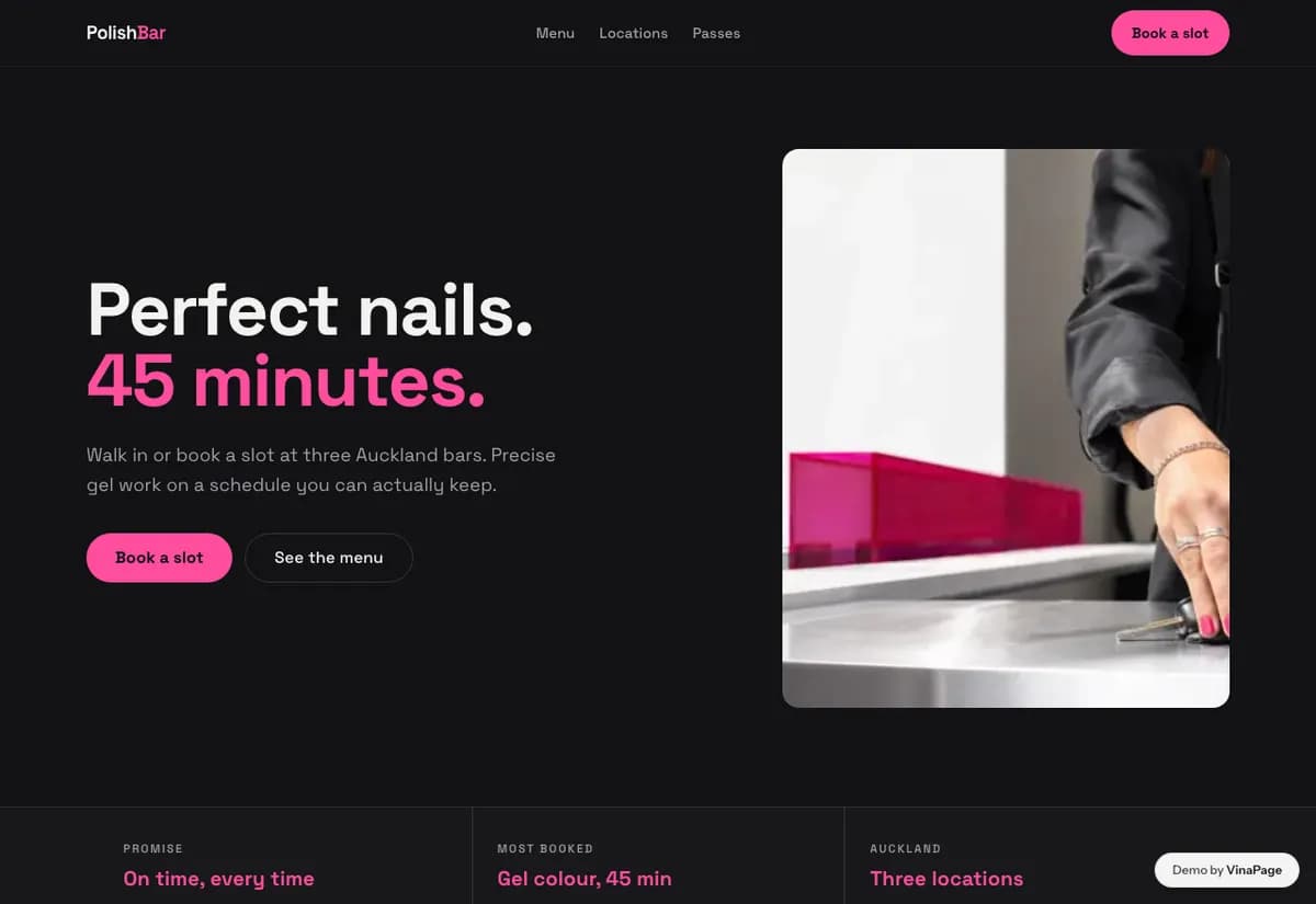
An express nail bar competes on speed and location, not on craft. The customer is deciding on a lunch break with fifteen minutes free, so anything that slows the page down costs a booking to whoever is next on the map.
Every design choice is subordinate to time to book. Restraint is not an aesthetic here, it is a way of removing everything that stands between arriving on the page and knowing where to go and how long it takes.
Design decisions
- 01
Locations are a first class page
For walk-in trade, which branch and how far is the whole question. Most salon sites answer it in a footer address, which is too late.
- 02
Duration is printed next to every price
Someone on a lunch break is buying minutes as much as a manicure. Leaving the time off forces a phone call the customer will not make.
- 03
One moving element, deliberately
A ticker at the top for what is available now. Everything else is still, so the moving thing means something.
What is built into it
- Locations page
- Duration next to price
- Availability ticker
- Passes page
Polish Bar is a design study. The business, its address and its reviews are invented so we can show a finished website instead of a flat mockup. Nothing on this page describes a real client of VinaPage.