
Sable Nail Bar
Neo-brutalist, cream and magenta, hard edges and oversized type. No soft gradients, no stock photography of hands on towels.
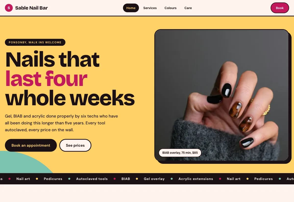
Most nail bars in New Zealand sell through a price list and a Facebook page. Both hide the only two things a client actually decides on: the shape and the colour. The price stays uncertain until someone is already in the chair, which is the moment it is hardest to walk away from.
Nail work is colour and shape. A soft neutral template flattens both, so every salon ends up looking like the same salon. A loud, plain frame does the opposite: it makes the work the brightest thing on the screen and lets ninety shades sit together without fighting the layout.
Design decisions
- 01
Shape first, colour second
The shape picker sits above the shade wall because that is the order people decide in. Choosing almond or square narrows the visual field before ninety colours arrive, so the colour wall reads as a choice rather than a wall.
- 02
The price adds itself as you tap
Every option in the booking flow updates a running total. The client sees the number grow, changes their mind while it is still free to change, and arrives already knowing what they agreed to. Removing that uncertainty is worth more than any discount.
- 03
The colour wall gets its own page
Ninety shades are a catalogue, not a section. Giving them a page makes them browsable on a phone during a lunch break and gives a reason to come back before booking.
What is built into it
- Shape picker
- Ninety shade colour wall
- Booking flow that prices itself
- Aftercare page
Sable Nail Bar is a design study. The business, its address and its reviews are invented so we can show a finished website instead of a flat mockup. Nothing on this page describes a real client of VinaPage.