
The Mineral Rooms
Mineral grey and copper, warm photography, and a treatments list that reads like a menu rather than a price sheet.
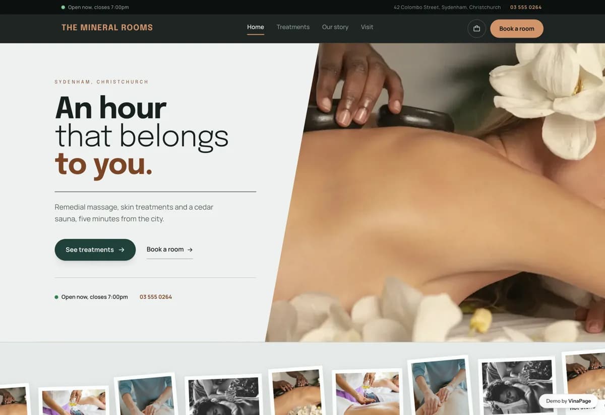
Massage studios sell time, not products, and time is hard to show. Most sites list treatment names and durations in a table and leave the visitor to guess what an hour actually feels like, or which of six massages is the one for a sore lower back.
A spa site competes with the visitor's own reluctance to spend money on themselves. Copy that describes the room and the pressure does more work than adjectives about relaxation, so every treatment says plainly what happens and roughly who it suits.
Design decisions
- 01
Duration sits with the price, not in a footnote
Sixty minutes at one price and ninety at another is the actual decision. Both are on the card, so nobody has to open a booking widget to find out what an option costs before they can compare it.
- 02
The sauna gets its own filter
Heat is a different reason to come in than bodywork. Filtering by massage, skin or sauna splits the list along the lines people already think in, instead of making them read twelve cards to find the one thing they wanted.
- 03
A booking basket, not a booking form
Treatments stack the same way dishes do, so a sauna plus a massage is two taps rather than a note in a comments box. The studio gets a request it can actually schedule against.
- 04
Honest about what the photos are
The demo runs on library photography and says so in the footer. A spa site sells trust, and the fastest way to lose it is a gallery of rooms the business does not have.
What is built into it
- Next.js
- Tailwind
- Motion
- Google Maps embed
The Mineral Rooms is a design study. The business, its address and its reviews are invented so we can show a finished website instead of a flat mockup. Nothing on this page describes a real client of VinaPage.