
Verbena Day Spa
Editorial grid in paper and plum. Magazine numerals, hairline rules, no rounded corners.
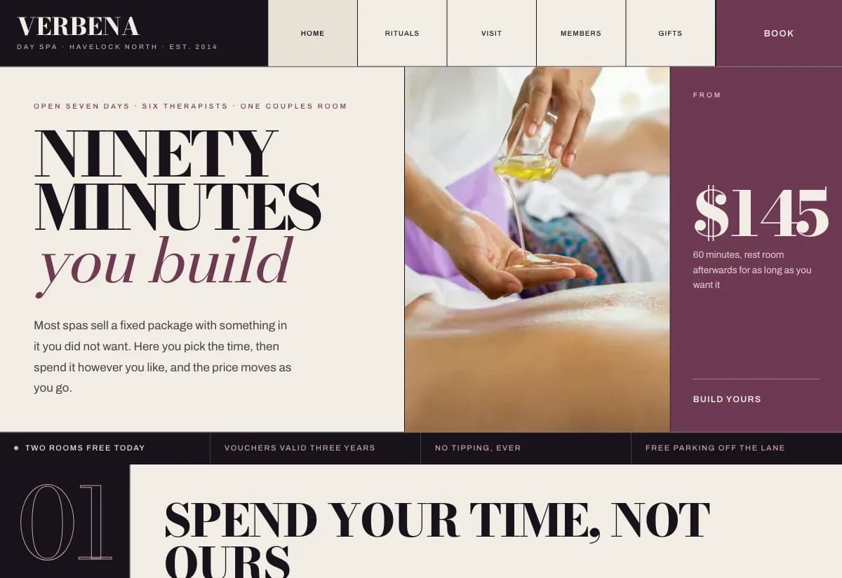
A day spa sells time, not treatments. Packaged menus force people to buy a fixed bundle that always contains something they did not want, so they either overpay or book nothing and think about it later.
A spa visit is planned rather than impulsive, and it is often bought as a gift. That is reading behaviour, not scrolling behaviour, so the layout is built to be read: wide margins, clear numerals, a price you can follow down the page.
Design decisions
- 01
You spend minutes instead of picking a package
Choose sixty, ninety or one hundred and twenty minutes, then switch segments on until the time is gone. Segments that no longer fit grey out rather than quietly stretching the appointment, which is the thing that makes a spa run late all afternoon.
- 02
The ritual follows you to the booking page
What someone builds on the home page is still there when they reach the booking form. Asking a person to rebuild their own choice on the next screen is where bookings get abandoned.
- 03
Gift vouchers get their own picker
Someone buying a gift is a different customer with a different question. They do not know which treatment the recipient wants, they know a budget, so the voucher flow starts from the amount.
What is built into it
- Ritual builder
- Running time and price total
- Gift voucher picker
- Members page
Verbena Day Spa is a design study. The business, its address and its reviews are invented so we can show a finished website instead of a flat mockup. Nothing on this page describes a real client of VinaPage.