
Bánh & Broth
Bright lime, chilli red and rice paper white with the dishes in motion.
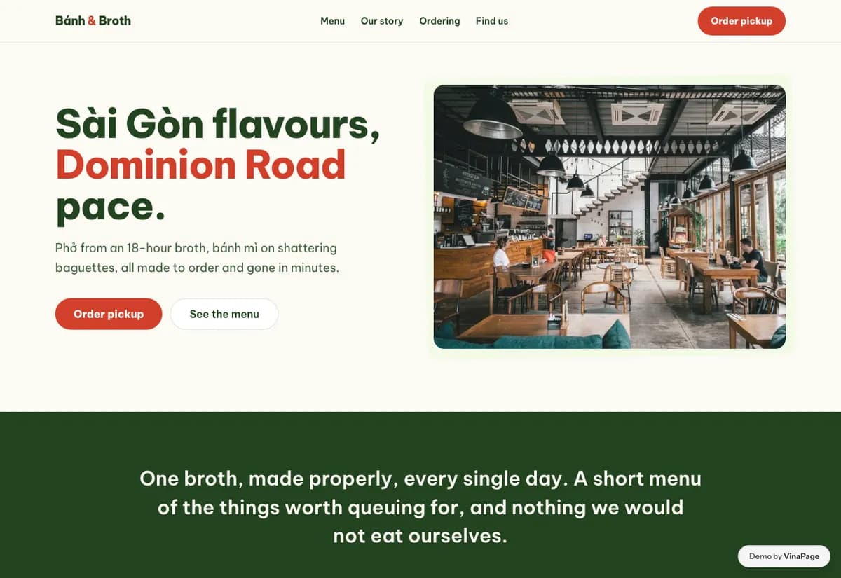
Vietnamese restaurants in New Zealand tend to land in one of two places: a shopfront with laminated photographs taped to the window, or a redesign so restrained that the street energy the food actually has disappears.
The default palette for an Asian restaurant site is dark wood and gold, which flattens every cuisine into the same generic idea of Asian dining. This food is loud, fast and green, so the page is built from the colours already on the plate.
Design decisions
- 01
The dishes scroll past like a pass
A moving strip of food rather than a static grid. It reads as a kitchen sending plates out, which is what the room actually feels like at midday.
- 02
Every dish is photographed because the names are unfamiliar
A diner who has not eaten Vietnamese food before cannot order from names alone. A photo next to each price removes the hesitation that makes people default to the one dish they recognise.
- 03
Table booking stays lightweight
This is a walk-in restaurant with a booking option, not the other way around. A heavy reservation system would misrepresent how the room works.
What is built into it
- Dish marquee
- Photo menu with prices
- Table booking
- Street-level palette
Bánh & Broth is a design study. The business, its address and its reviews are invented so we can show a finished website instead of a flat mockup. Nothing on this page describes a real client of VinaPage.