
Kapiti Brew Co
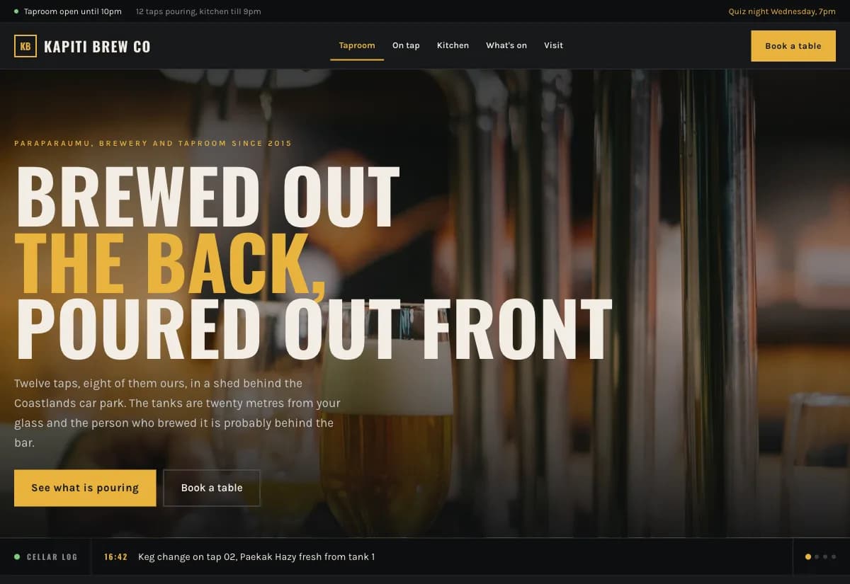
Dark industrial taproom. Near black, brushed metal tones, tight condensed type and a board that reads like the one hanging above the bar.
A taproom changes what is pouring every week. A brochure website is out of date the day after it launches, so staff give up on it and send people to social media instead, where the menu is buried under photos of the weekend.
The room itself is the brand for a taproom, and the room is dim, warm and full of hard surfaces. A bright airy site would promise a place that does not exist. Matching the light in the room means the photos on the page and the photos people take inside look like the same business.
Design decisions
- 01
The tap board is the homepage
Not a hero image with a tagline. The first thing on the page is what is pouring right now, because that is the only question a person opening the site on a Friday afternoon is asking.
- 02
A cellar log that ticks over
A short running record of what was tapped and when. It proves the site is tended rather than abandoned, and it gives a regular a reason to check back that has nothing to do with a marketing email.
- 03
Booking by day and time slot, not a phone number
Groups decide in a group chat, usually after the phone line has closed. A slot picker captures the table at the moment the decision happens instead of asking people to remember to ring in the morning.
What is built into it
- Live tap board
- Cellar log
- Table booking by day and slot
- Kitchen page
Kapiti Brew Co is a design study. The business, its address and its reviews are invented so we can show a finished website instead of a flat mockup. Nothing on this page describes a real client of VinaPage.